Examples of Reputable and Non-Reputable Websites

Screen Shot 2013-11-03 at 11.41.21 pm

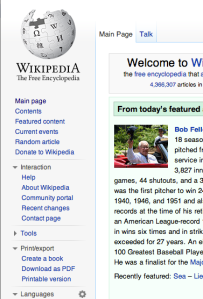
Wikipedia is mentioned as a non-reputable website, which is not always the case. If the user follows the links in the reference section of the page, then it is a great starting point. In saying this, Wikipedia should never be referenced.

Screen Shot 2013-11-03 at 11.41.48 pm

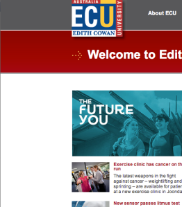
For anyone looking to do anything at Edith Cowan University, this is the place to be. This is one of the most reputable sites I know of and is where I start in almost all of my research.

Screen Shot 2013-11-03 at 11.42.31 pm

As they say, beauty is in the eye of the beholder. In terms of a legal stand point, The Pirate Bay is one of the worst websites on the internet, stealing information from people just trying to make a living. To the eye of the consumer, it is a godsend, providing free content that would cost up to the hundreds of dollars.

Screenshots:

en.wikipedia.org

ecu.edu.au

thepiratebay.sx

Wikipedia – always tells lies… most of the time – Week 4

Question 1)

We all use the Internet and, if we were to who uses it the most, university students would probably be in the top five due to the amount of research that is done online in this day and age. This is why it is important to evaluate websites that have information that may relate to your chosen topic. The amount of misleading information on the Internet is always on the rise and, according to the reading (Fogg, 2003, p.122) the credibility can also be defined as believability – and it is so much easier to create believable content on the Internet.

As opposed to face-to-face conversation, it is harder to see if a person is lying to you in a chat room or on an unreliable website. There are also not immediate consequences for questionable behaviour online, which leads to behaviour like cyber-bullying. There is no agency stopping these sorts of people and students are particularly at risk because it is an easy way of receiving information.

The risk of these people are why subtends should always check their sources and always go for journal articles.

Question 2)

Wikipedia is one of the greatest sources of online information in the world with, arguably, billions of articles relating from insects to incest and, regrettably, everywhere in between. In my opinion, it should be used on a day-to-day basis and even used in conjunction with research. However, it should not be referenced directly. Wikipedia should be used as a starting point and should never be referenced, but why should we reference this huge resource?

The one simple reason is that Wikipedia is, as the name suggests, a “wiki”. As defined by the Oxford Dictionary, a wiki is “a website or database developed collaboratively by a community of users, allowing any user to add and edit content.” (2013) If any user can edit this content, than questionable people who don’t have the motives of reliable educators can access information and edit it.

Even though Wikipedia has become good at blocking people who want to edit the content wrongly, it’s still not 100% reliable. It is always the best to check out the citations that the writers of the article have used and follow those instead of quoting Wikipedia directly.

Question 3)

The following issues may affect web credibility:

  • As we become more familiar with the Internet and information that is trustworthy, the spread of inaccurate information may become quicker than it is now. Social Media is contributing to this and, without it; the Internet would be a more credible place for information.
  • Also another formality of becoming friendlier with technology is that people, who have no intention of doing the right thing, may have the power to make more convincing alterations to Wikipedia and other “wiki” sites. They may also alter the IP addresses, or hide them, so they can keep on altering content. This is a big worry for the future of Wikipedia.
  • I experienced, throughout my studies in the area of credibility, that blogs may, in fact, loo untrustworthy but some are better sources than Wikipedia and its references. If people get smart and look into the people who are writing these blogs, industry professionals might run them. If people do research into their research – then they may find more information.

Work Cited

Oxford University Press. (2013, Oct 27). Definition of wiki in English. Retrieved Oct 27, 2013, from Oxford Dictionaries : http://www.oxforddictionaries.com/definition/english/wiki?q=wiki

Fogg, B. J. (2003). Credibility and the world wide web. In Persuasive Technology: Using Computers to Change What We Think and Do (pp.122-125. Amsterdam: Morgan Kaufmann

We are all Lazy – Week 3

People are lazy. I know that, you know that and Americans like to remain ignorant to the fact that they are, but they’d rather not talk about it. We search every day for easier solutions to day-to-day quibbles that the first world population has. However, did you that our need to be lazier has a name? Well, it called the Performance Load.


According to Galitz (2007), performance load follows “the past of least resistance principal” and puts emphasis on that “the greater effort to perform a task, the less likely it will be accomplished successfully”. The drive for success and the fear of failure, even from early ages such as 5 and 6 year olds (Church, 2004), is what makes humans choose a lesser load over a higher load.


One example of the performance load being reduced in order to increase success rates are vending machines. In this day and age, the consumer of whatever just happens to come out of a vending machine has many ways to pay for their chosen item. Gone are the old days of coin-operated machines (coin-op), with their being multiple ways to pay for that soft drink or chocolate bar. New contactless credit card technology, improvements to mobile cellular networks, as well as the older note acceptance devices make it more than easy to grab a snack or drink and all but eliminates the excuse of “I don’t have any change”.


Along with these benefits, Intel (a producer of the contactless technology) has reported that sales at their vending machines in the United States have gone up by up to 30% (2011). So, not only do these machines promote a lesser performance load, but also drives up profits for the companies using it.


The reason why performance load is important today is because the people who make the things that reduces performance load are profitable companies. As long as consumer products are around – you should expect the performance load to keep on reducing until, maybe, we don’t have to do anything at all.


Church, E. B. (2004). 5-6 YEARS: Fear of Failure. Scholastic Parent and Child , 12 (3), 87.

Galitz, W. O. (2007). Performance Load. In W. O. Galitz, The Essential Guide to User Interface Design : An Introduction to GUI Design Principles and Techniques (3rd Edition ed., pp. 84-85). Indianapolis, Indiana, USA: Wiley.

Intel Corp. (2011, January 20). Contactless Payment Technology Drives Higher Vending Machine Revenue. Retrieved Oct 19, 2013, from Intel: http://www.intel.com.au/content/dam/doc/case-study/retail-core-i3-touchgo-study.pdf


Consistency Examples

coles_logo (1)

The first example is the logo of Coles supermarkets and how it has changed, but, also remained the same. The big 2 supermarkets (Coles and Woolworths) have been going through these changes in logos. This is Coles’ old logo and features a yellow circle around a red tick with the slogan “save everyday”. This logo was in use before the new logo (see below).

coles_logo

As we can see with the new Coles Supermarkets logo, it has omitted the red tick surrounded by the yellow circle which, at first, seems like they haven’t a consistent structure in designing their logo. However, as is seen, the marketing directors at Coles have kept the font and the specific red colour. What they have done is changed the logo but they have kept it familiar at the same time – which doesn’t scare the customers of the Supermarket. This clever type of marketing has also carried across to Woolworths as well.

Woolworths Logo

woolworths_logo

The Woolworths logo of recent times has changed from somewhat of a flat, horizontal design to one with more flare and curves – but we still associate the new logo with Woolworths as much as the old one. Woolworths has done the same as Coles by using familiar colours and combining the “W” style in their logo to make it blindingly obvious to the customer that it is Woolworths.

Changing without being frightening – that is what consistency is all about.

Photos

Changing while remaining the same – Week 2

Even though, in this day and age, companies are moving forward and changing how they run their business and who they hire so they can run more efficiently than ever before in the tough economic climate. Even though change is good in these areas of business, it is not always the best idea in others.

A huge change in a business would be something like a name change, a move that any well-established brand wouldn’t dare to make and, according to the Learning Portfolio Reading for Week 2, this fear of change is well founded.

The principal of Consistency is a major part of not just businesses, but, also a functioning society. Traffic lights and VCR controls have carried across to countries, cultures and devices all over the world. This is called functional consistency and is one of the four types of consistency.

One of the other principals of consistency is Aesthetic. This refers to constancy relating to things like company logos and names, as referred to in the first paragraph. A changed logo is not a huge change, in fact, according to Gregory Ashworth and Mihalis Kavaratzis, city councils around the world often do this as a part of a marketing strategy and don’t complete the whole thing. (2009)

Internal consistency sort of speaks for itself. It is when things like signage or uniform inside a place or building. This instils trust in the customer or patron and is most commonly used inside train stations, stadiums, schools and parks to name a few.

Finally, external consistency is the opposite of internal consistency and notes that consistency of sounds like fire alarms, warning labels and even bar codes make it easier for people to understand. It could be said that all these consistency elements attribute to the grater understanding of the population and makes just about everything easier for everybody.

Ashworth, G., & Kavaratzis, M. (2009, Jul/Aug). Beyond the logo: Brand management for cities. The Journal of Brand Management , 520-531.


Examples of the Aesthetic Usability Effect.

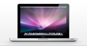
MACBOOK

This is the example that I’ve been referring to throughout part A. The MacBook is the best example of where aesthetically pleasing design meets usability. The MacBook was the forefront of what laptops look and feel like in the current generation of Windows laptops, such as the Lenovo Think Pad, as its easy to use, simple design along with its clean and user friendly software. This combination is what makes sales of this laptop exceed others in its class. The MacBook is the example of user-focused design.

ergonomic-office-chair-1103

The ergonomic officer chair is another product that ticks the boxes of design and useability. The design of the office chair is very appealing, with curved lines gives it a modern feel and look. However, the usability of the ergonomic chair is where it has become an office staple. It hugs and supports the body, making sitting down for long periods of time easy and the long-term problems, such as back pain, less severe. It is also cheap to buy and often comes in easy to assemble flat pack. The ergonomic chair is a testament to the Aesthetic Usability Effect.

multiat-is-a-multi-functional-arthritis-tool-that-helps-user-to-do-a-range-of-daily-tasks2

People with arthritis suffer everyday with their debilitating illness. With 3.85million Australians currently with arthritis and it costing 23.9million dollars to the healthcare system (Arthritis Australia, 2012) it is easy to see why business invest in products aimed at people who suffer arthritis. The product above is just an example of the many products available to sufferers. As this is a highly competitive market, these products require the usage of the Aesthetic Usability Effect. Curved designs and contrasting colours of most products make it aesthetically pleasing and practical as it helps the users to see and grab the product. In this market, Aesthetic Usability Effect has to be implemented to succeed.

Works Cited:

Arthritis Australia. (2012, June 1). What is Arthritis? Retrieved Oct 23, 2013, from Arthritis Australia: http://www.arthritisaustralia.com.au/index.php/arthritis-information/what-is-arthritis.html

The Aesthetic Usability Effect

While typing on this MacBook that I was kindly gifted for my birthday, I tend to overlook the subtle design features that Apple has spent billions of dollars trying to perfect – mostly due to the fact that, because of heavy procrastination, I don’t have time to do anything at all. But everything form the size of the screen to the spacing of the keys is taken into account when designing this best selling laptop. These days it is all about the user and what they demand and has become somewhat expected of any designer to take the user into account (Boulton, 2005).  This is called the Aesthetic Usability Effect. 


This is the relation between how good a design looks and how the user will react to it and consume the product – weather it be a car or a t-shirt. However, this is not a guarantee that the product or item will be a huge success, much like almost all Apple products. The item also has to be useable to the user as well as look nice. In a study published in Computers in Human Behaviour it was found that the aesthetic appeal did not affect the perceived usability of the item, however, once the users started using the product, the aesthetic appeal went down due to the low usability of the product (Tuch, Roth, Hornbæk, Opwis, & Bargas-Avila, 2012).


So, in short, the prettier the item does mean that people will want to use it, but this is not a “sure fire” way of producing a great product. It has to be usable and aesthetically pleasing for it to be on the level of the Apple MacBook that I’m typing on today.


Works Cited


Boulton, M. (2005, March 6). Aesthetic-Usability Effect. Retrieved Oct 30, 2013, from The Personal Disquiet of Mark Boulton: http://www.markboulton.co.uk/journal/aesthetic-usability-effect


Tuch, A. N., Roth, S. P., Hornbæk, K., Opwis, K., & Bargas-Avila, J. A. (2012). Is beautiful really usable? Toward understanding the relation between usability, aesthetics, and affect in HCI. Computers in human behavior , 28 (5), 1596-1607.