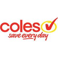
The first example is the logo of Coles supermarkets and how it has changed, but, also remained the same. The big 2 supermarkets (Coles and Woolworths) have been going through these changes in logos. This is Coles’ old logo and features a yellow circle around a red tick with the slogan “save everyday”. This logo was in use before the new logo (see below).
As we can see with the new Coles Supermarkets logo, it has omitted the red tick surrounded by the yellow circle which, at first, seems like they haven’t a consistent structure in designing their logo. However, as is seen, the marketing directors at Coles have kept the font and the specific red colour. What they have done is changed the logo but they have kept it familiar at the same time – which doesn’t scare the customers of the Supermarket. This clever type of marketing has also carried across to Woolworths as well.
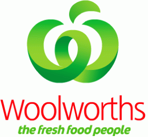
The Woolworths logo of recent times has changed from somewhat of a flat, horizontal design to one with more flare and curves – but we still associate the new logo with Woolworths as much as the old one. Woolworths has done the same as Coles by using familiar colours and combining the “W” style in their logo to make it blindingly obvious to the customer that it is Woolworths.
Changing without being frightening – that is what consistency is all about.
Photos


